Lecture 6: Bootstrap continued, Intro to JavaScript

To-do for today’s class

Helpful Readings

Slides


Link to download PDF version.
Completed Files

Lecture 3: IDs, Classes, div Tag, CSS float

To-do for today’s class

Slides

View Slides

Link to download PDF version.
Helpful Readings

Completed Files

Completed files are stored in a GitHub repository. Links below will take you to a list of file(s) from today’s lecture. You can view the code via the browser through GitHub’s UI or clone/download the repo to open the code from your computer.

Lecture 5: Flexbox, CSS Frameworks, Bootstrap

To-do for today’s class

Helpful Readings

Slides

Link to download PDF version of slides.

Completed files

Assignment 3: Bootstrap Company Site

Overview

For this assignment, you will create a mobile-first, responsive fake company website (two pages) using the Bootstrap CSS framework. You must create the site using Bootstrap components and Bootstrap’s Grid framework with some customization as needed.

Requirements

Setup
  1. Create two brand new HTML files.
    1. Name one home.htmland the other team.html
    2. Add in the required bootstrap meta tags and the bootstrap CSS file (either relative or absolute link).
  2. Create one brand new CSS file.
    1. Write CSS in this file.
    2. Link this CSS file to both home.html and team.html.
  3. Gather text and images for this assignment. Come up with a fake company name and some text that can describe the company’s product or services. Have fun with it — make up any company you ever wanted to create.
    1. Get free beautiful images at https://unsplash.com/ 
  4. Your site needs to be built using the mobile-first approach (already built in with Bootstrap but any extra CSS you add must follow the mobile-first approach).
  5. Most of the site can be built using what Bootstrap comes with, plus a few customizations. Refer to the Bootstrap documentation and hints listed below.
  6. Check your HTML and CSS syntax. You will be deducted points for any syntax errors, tags not closed/not used, etc.
Homepage (home.html)
  1. Navigation Bar
    1. Displays name of company and at least three links: Home, Team, and one other link.
    2. Clicking on the name of company goes to home.html. Clicking on “Home” goes to home.html. Clicking on “Team” goes to team.html. Third link does not need to go anywhere.
    3. “Home” link is a different color than other three links to indicate user is viewing the Home page.
    4. Nav bar must have a background color that is not the default color. You must overwrite the default background color that comes with Bootstrap.
    5. Hint: Refer to Bootstrap documentation on the Navbar component.
  2. Header at the top includes:
    1. Background image
      1. Use CSS property background-image to include a background image on the header.
      2. You may use background-size: cover; to make the image look good across all screen sizes.
      3. Play around with background-position to position the background image if you’d like.
    2. Company name
    3. Company slogan
  3. Below the header, a featured section that displays text and pictures that showcase at least two features of the company’s product or services.
    1. Each feature has some heading text, a paragraph, and an image.
    2. A line between each feature.
    3. Must use Bootstrap’s Grid system to create the rows and columns in this section (for all screen sizes).
      1. Hint: use .container, .row, and various .col classes (refer to Bootstrap documentation)
  4. Footer on the bottom of the page.
  5. Mobile Devices (0 – 767px):
    1. Single-column layout,
    2. Navbar collapses into a hamburger menu (refer to Bootstrap documentation on how to easily implement this).
    3. Featured section’s order from top to bottom must be Feature 1 heading, Feature 1 description, Feature 1 image, Feature 2 heading, Feature 2 description, and Feature 2 image.
    4. Some spacing around each feature (not edge to edge)
  6. Tablet Devices(768px – 991px):
    1. Navbar expands to show all nav links.
    2. One feature per row.
      1. Alternate order of picture and text per row.
      2. Column that contains feature’s text must not be the same width as the column that contains the feature’s image.
    3. Leave whitespace around each feature (not edge to edge)
  7. Desktop Devices (992px and above):
    1. Layout remains the same. Adjust as necessary.
  8. For each device, adjust font sizes, images sizes, etc. as necessary.
  9. All elements and content need to be readable.
  10.  Feel free to play around with Bootstrap and get familiar with it. Bootstrap is extremely useful and is used widely in industry. You are welcome to add additional features, as long as all requirements above are satisfied.
Team (team.html)
  1. Navigation Bar requirements the same as home.html. Navigation bar must look exactly the same in both home.html and team.html.
    1. “Team” link is a different color than other three links to indicate user is viewing the Team page.
  2. Header remains the same, except the heading must read “Our Team” or similar.
  3. Below the header, display at least three team members. Display each team member’s:
    1. Image
    2. Name
    3. Job title
    4. Short bio
    5. A colored “View more” button (that does not need to link anywhere)
  4. Mobile Devices (0 – 767px):
    1. Navbar and header follow the same requirements as Home page.
    2. One team member per row.
  5. Tablet Devices(768px – 991px):
    1. Navbar and header follow the same requirements as Home page.
    2. Three team members per row.
  6. Desktop Devices (992px and above):
    1. Layout remains the same. Adjust as necessary.
Submission/Upload to the server

Until the server is fixed, submit all files to Blackboard. Follow the below steps:

  1. Rename the folder that contains all your A3 files to: ITP303_Assignment3_[usc username]
  2. Compress this folder to a .zip file.
  3. On Blackboard, go to Assignments -> Assignment 3: Bootstrap Company Site and upload the .zip file here.
  4. You will be able to make unlimited submissions. Only the last submission will be graded.

Sample

Note: Samples below don’t always meet all the requirements. Make sure to follow the requirements rather than solely relying on the samples.

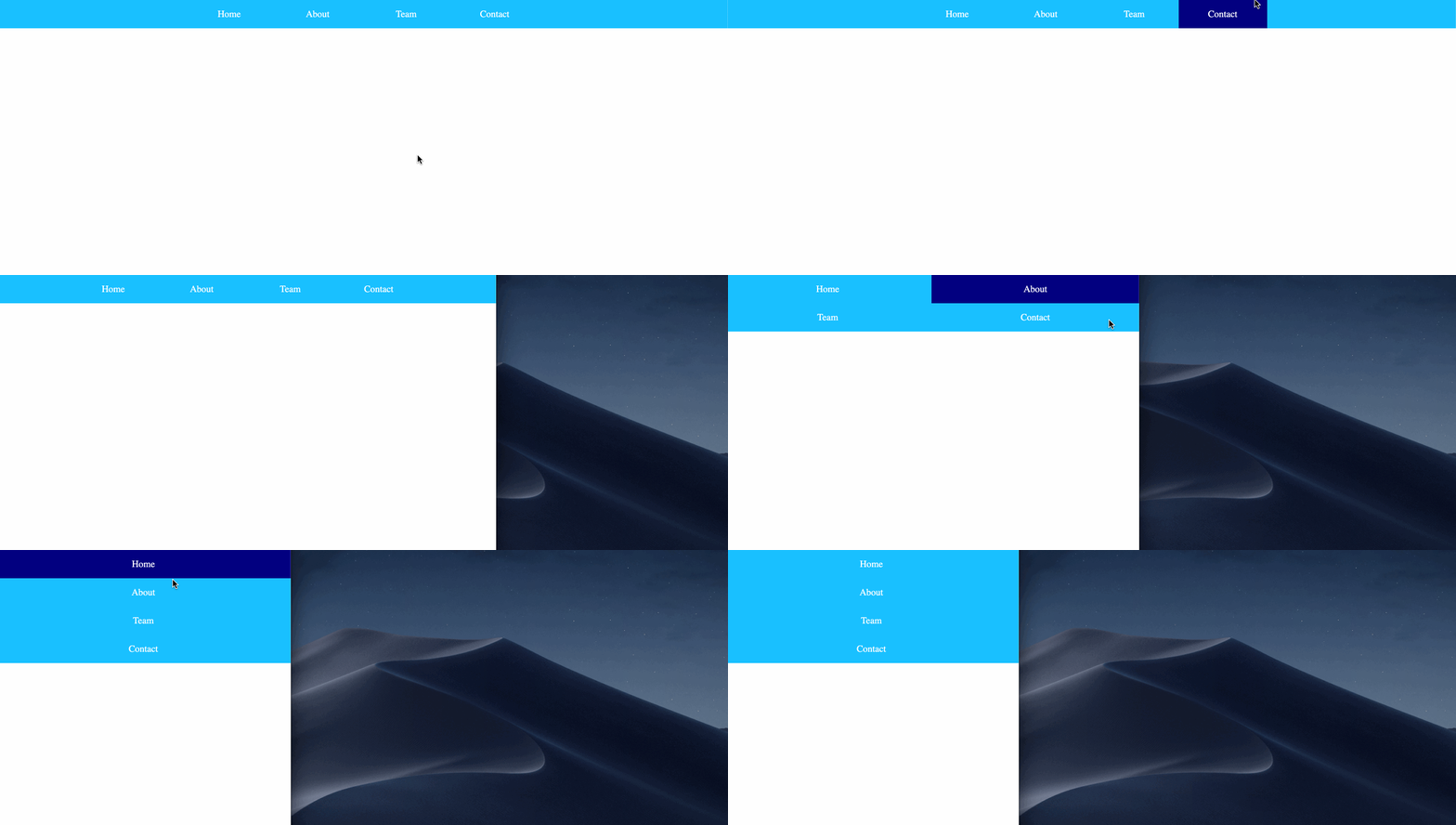
Lab 3: Flexbox Nav

Overview

This lab is intended to give you a basic understanding of how CSS flexbox works and its benefits vs using float in previous lab/assignments.

Sample

Requirements

  1. Create a brand new HTML file named flexbox-nav.html (all lowercase, no spaces).
  2. You may write CSS in either an internal or external stylesheet. No inline styles.
  3. Create a <div> with four <a> inside. The links do not need to go anywhere at this point. Use # as a placeholder for href, like this: <a href="#">
  4. Add some basic styling, such as:
    1. A background color on all the <a>
    2. Hover effect to change background color on all the<a>
    3. Add padding top/bottom on all the <a> to create some spacing on top/bottom.
    4. text-align: center to align all the text to the center
  5. Using only flexbox properties (do not use floats!), style the navigation so that:
    1. Desktop (screen sizes 992px and above):
      1. All nav items are in one row.
      2. All nav items have the same width.
      3. Text is horizontally centered.
    2. Tablet (screen sizes 768px – 991px):
      1. Two nav items per row.
      2. Each nav item takes up half the width of the row.
    3. Mobile (screen sizes 0px – 767px):
      1. One nav item per row.
  6. You do not need to use flex-growth, flex-shrink, and flex-basis properties (which we did not go over in lecture). Using width is enough to satisfy the lab requirements.
Submission/Upload to the server

Until the server is fixed, submit all files to Blackboard. Follow the below steps:

  1. Rename the folder that contains all your Lab3 files to: ITP303_Lab3_[usc username]
  2. Compress this folder to a .zip file.
  3. On Blackboard, go to Assignments -> Lab 3: Flexbox Nav and upload the .zip file here.
  4. You will be able to make unlimited submissions. Only the last submission will be graded.

Lecture 2: HTML & CSS

To-do for today’s lecture

  1. Attendance is taken starting today. Go to Blackboard -> Tools -> Qwickly Attendance to enter the code for today’s attendance. If you are taking this class asynchronously, watch the lecture recording and fill out this google form.
  2. Copy and paste the following text when prompted:

Pikachu is a species of Pokémon, fictional creatures that appear in an assortment of media of the Pokémon franchise by The Pokémon Company. Pikachu is a yellow mouse-like Pokémon with powerful electrical abilities. Pikachu is the best-known species of Pokémon, largely due to its appearance in the anime series as the starter Pokémon of the protagonist, Ash Ketchum. Pikachu is a major character of the Pokémon franchise as well as its mascot, and has become an icon of Japanese pop culture in recent years, as well as one of the major mascots for Nintendo.

Pikachu’s design was conceived by Atsuko Nishida and finalized by Ken Sugimori. Pikachu first appeared in Pokémon Red and Green in Japan, and later in the first internationally released Pokémon video games, Pokémon Red and Blue, for the Game Boy.

Slides

View Slides
Link to download PDF version.
Helpful Readings

Completed Files

Completed files are stored in a GitHub repository. Links below will take you to a list of file(s) from today’s lecture. You can view the code via the browser through GitHub’s UI or clone/download the repo to open the code from your computer.

Assignment 2: Responsive Product Page

Overview

For this assignment, you will create a mobile-first, responsive web page about a product. Choose any product you wish to “sell.” You can grab images and text about any existing product or you can make up your own.

Requirements

HTML & CSS
  1. Create a new folder named assignment02.
  2. Create a brand new HTML file in this folder. Name it product.html.
  3. Use at least ONE custom font (meaning not a default font like Times New Roman or Arial). You can use google fonts or your own font.
  4. Do not use flexbox or bootstrap on this assignment. You must use floats, percentages, and media queries to create rows and columns for this page and make it responsive to different screen sizes.
  5. Required components:
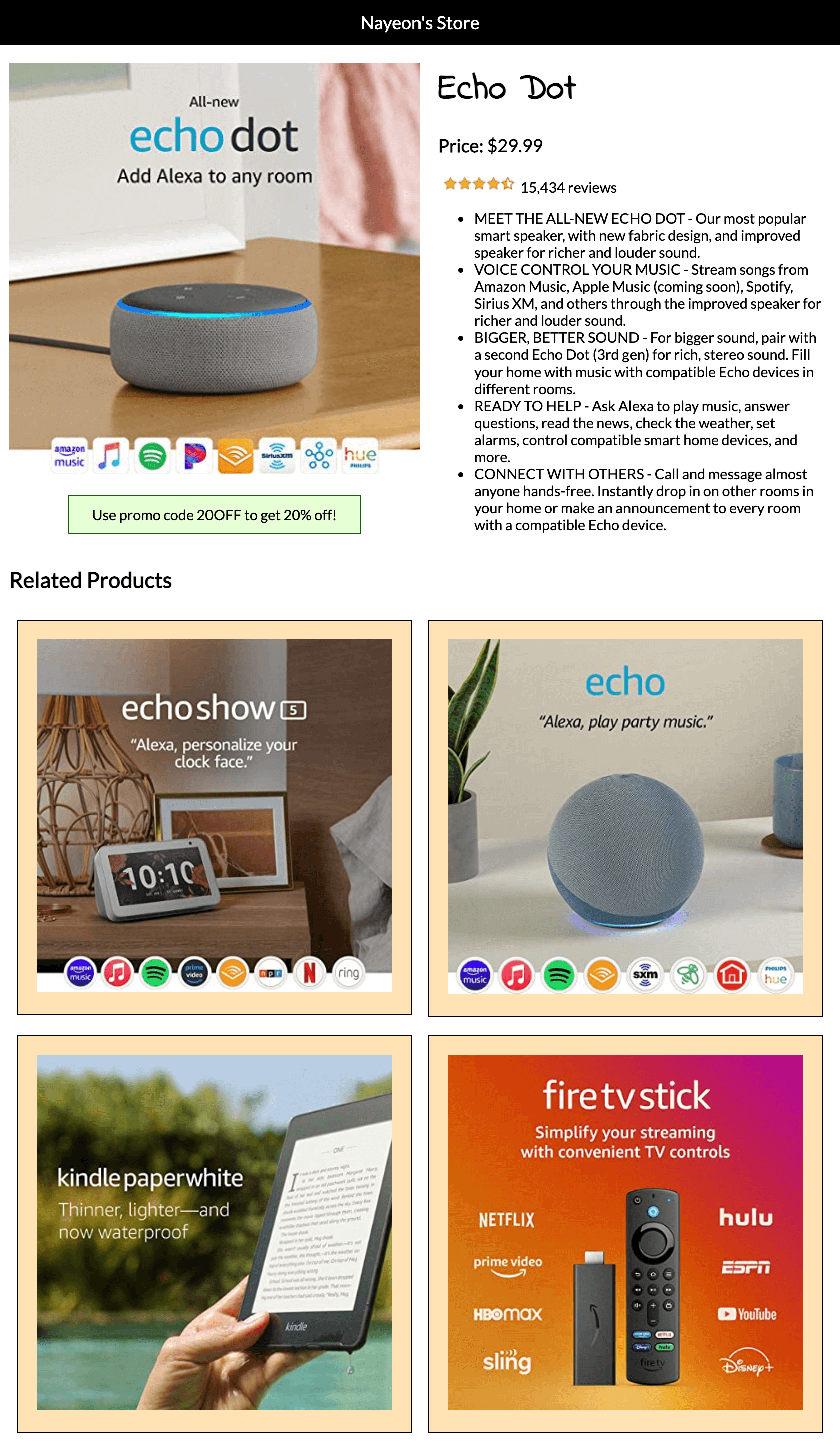
    1. A colored bar on top that states name of your online store.
    2. A product that is being sold. Display the name, image, price, number of reviews (ok if it’s an image), and description.
    3. A colored promo code box.
    4. A related products section where at least four (4) other product names and images are displayed.
      1. Each product column must have some spacing and border around it.
  6. Your site needs to be implemented using mobile-first approach.
    1. Default CSS should be for mobile (0-767px). Then use media queries to handle tablet sizes (768px – 992px) and desktop sizes (992px and above).
    2. Hint: See slides for a better understanding of writing CSS mobile-first vs desktop-first.
    3. Hint 2: See mobile-first sample code here: https://codepen.io/nayeon/pen/OJLQXKz?editors=1100 . Try resizing the browser and see what happens to the header. Read comments in the CSS panel.
  7. Before writing code right away, you may find it helpful to review the samples and plan on how to construct your divs first. Sketch out boxes on a piece of paper and plan out how divs will change depending on the screen size.
  8. Mobile Devices (0-767px):
    1. Single-column layout,
    2. Name of the product is above the product image.
      1. Hint: You can hide any elements using display, visibility or opacity. Show this product name on only mobile screen sizes.
    3. Below the product image, display a colored promo code box with some info in it.
    4. Promo code box width is smaller than the main product’s image.
    5. Promo code box is horizontally centered.
    6. One (1) related product item is displayed per row.
      1. Create a <div> for every related product. Put image inside this div. Add border around the <div> and not the image.
      2. Each related product image has some spacing around it.
      3. Background color for each related product column is not required but will be helpful to visualize what your code is doing.
    7. Related products all have a width that is smaller than the main product’s image.
    8. Related products are all horizontally centered.
    9. All images scale up as browser size increases.
  9. Tablet Devices (768px – 991px):
    1. Two-column layout – the product image and promo code box on the left and the product details on the right.
      1. Product name is on top of the product details on the right.
      2. Hint: You can hide any elements using display, visibility or opacity. Show this product name on screensizes for tablet devices and up.
    2. Two (2) related products listed per row.
    3. All images scale up as browser size increases.
    4. The bar on top with store name is as wide as the browser
  10. Desktop Devices (992px – above):
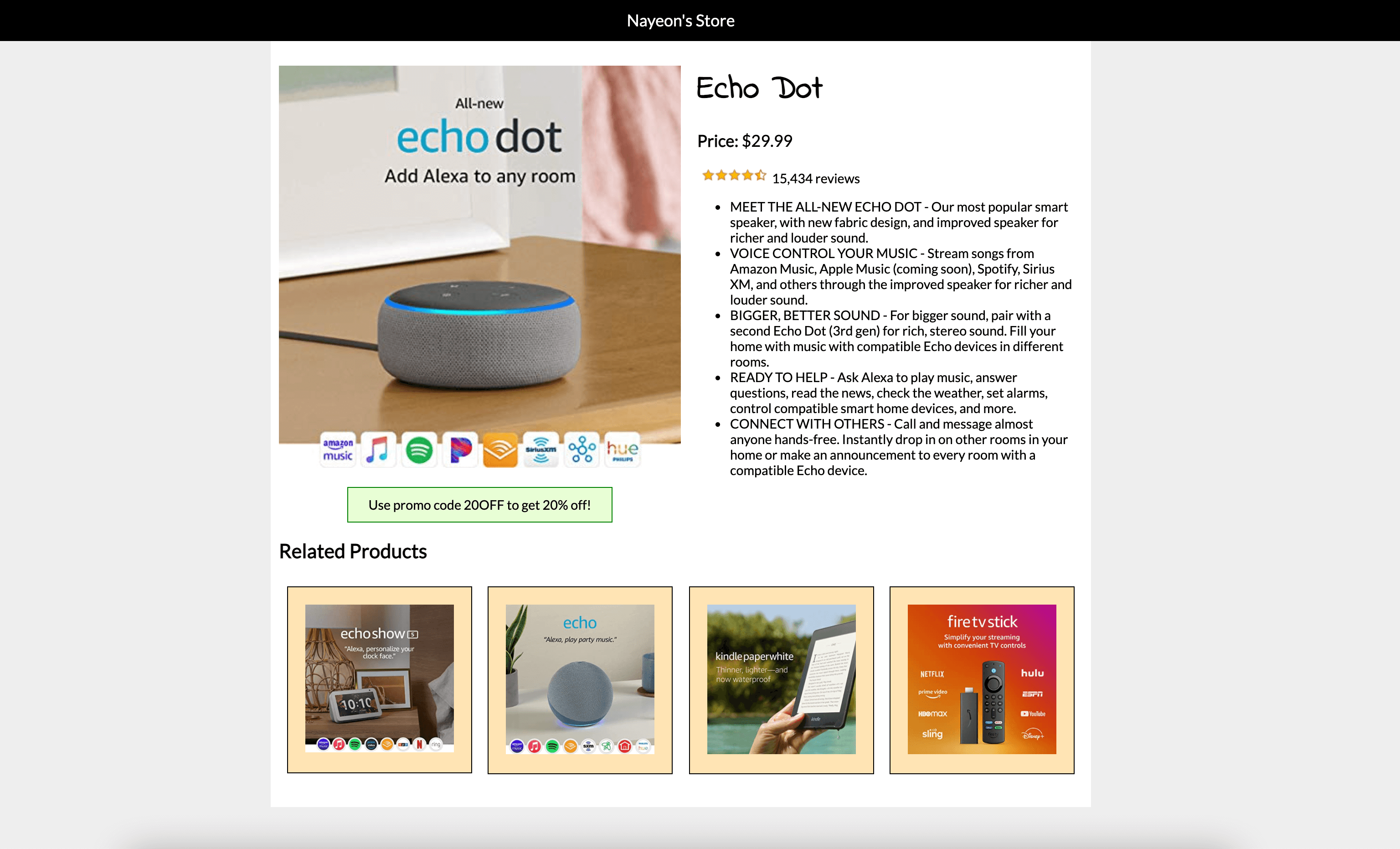
    1. Two-column layout,
    2. Four (4) related products listed per row
    3. All images scale up as browser size increases.
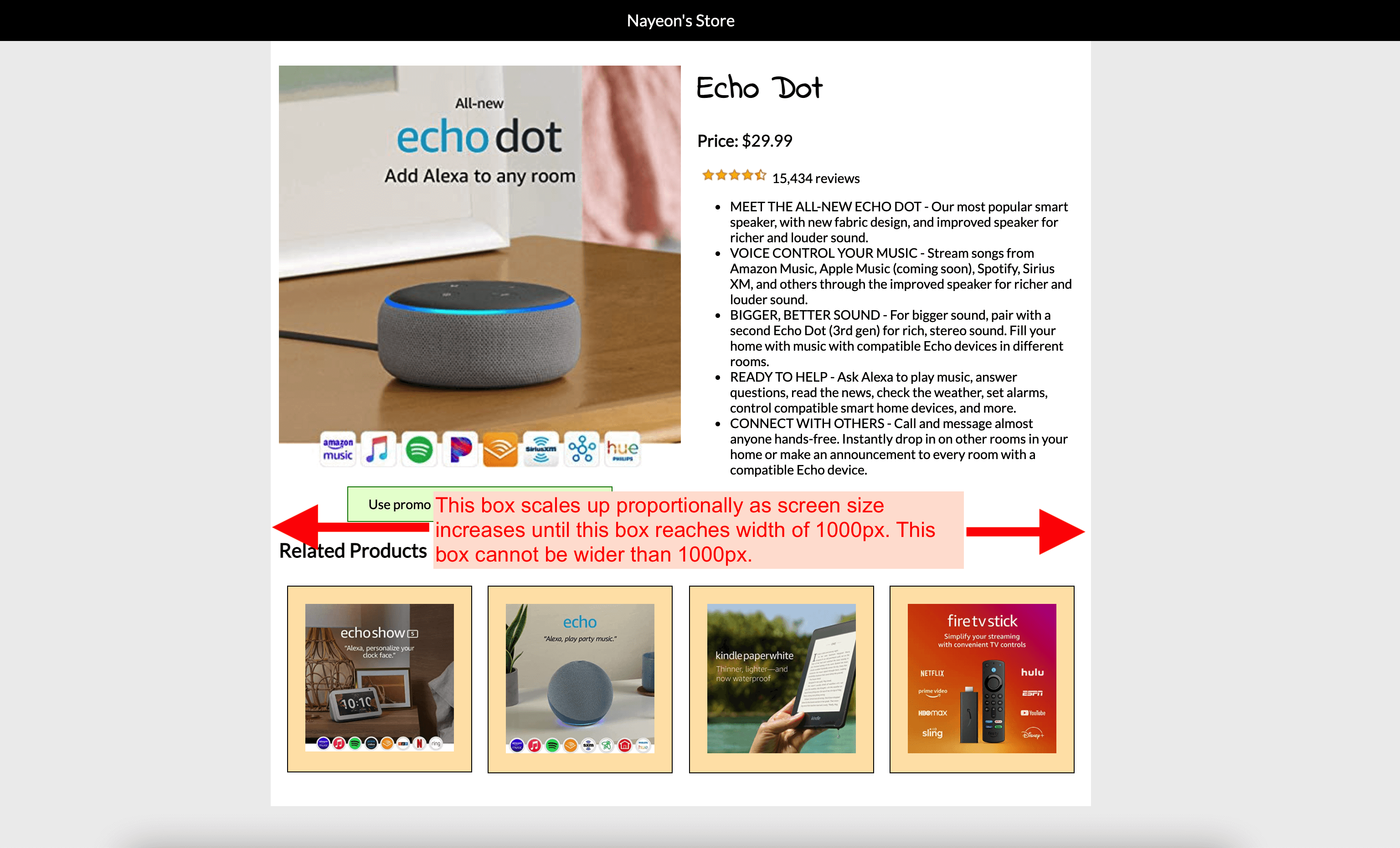
    4. The “box” that contains all the product information must not grow wider than 1000px.
    5. The bar on top with store name must always be as wide as the browser.
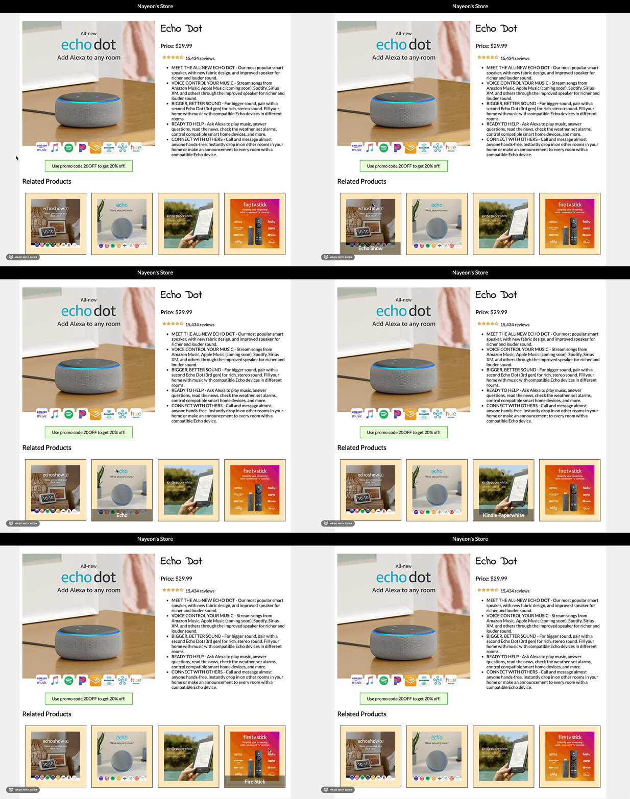
  11. Hover effect:
    1. When user hovers over any related product, show an overlay (div) that contains the related product’s name.
    2. The overlay must overlap the related product image (not be below the image).
    3. The overlay must be positioned at the very bottom of each product.
    4. The width of the overlay box must be exactly the same width as the related product column at all screen sizes.
    5. Horizontally center the related product’s name in the overlay.
    6. The overlay must have a background color that is slightly transparent.
      1. Hint: CSS value rgba() is helpful here.
  12. For each device, adjust font sizes, images sizes, etc. as necessary.
  13. All elements and content need to be readable.
  14.  Feel free to add additional features, as long as all requirements above are satisfied.
  15. Check your HTML and CSS syntax. You will be deducted points for any syntax errors, tags not closed/not used, etc.
    1. Use a validator like this one: https://validator.w3.org/#validate_by_input.
Submission/Upload to the server

Until the server is fixed, submit all files to Blackboard. Follow the below steps:

  1. Rename the folder that contains all your A2 files to: ITP303_Assignment2_[usc username]
  2. Compress this folder to a .zip file.
  3. On Blackboard, go to Assignments -> Assignment 2: Responsive Product Page and upload the .zip file here.
  4. You will be able to make unlimited submissions. Only the last submission will be graded.

Sample

Note: Samples below don’t always meet all the requirements. Make sure to follow the requirements rather than solely relying on the samples.

Mobile:

Tablet:

Desktop:

Desktop sizing details:

Hover Effect:

Lecture 3: CSS Selectors, Cascade, Page Layouts

To-do for today’s class

  • Save this folder in the itp303 folder you created last lecture:
    https://drive.google.com/drive/folders/10r-zrlMOjxPgZ0hj-2ntWgdC4t16wSxb?usp=sharing
    Click on the name of folder (down arrow) and click “Download” to get all the files.
  • Copy paste the following text:The Coachella Valley Music and Arts Festival (commonly called Coachella or the Coachella Festival) is an annual music and arts festival held at the Empire Polo Club in Indio, California, in the Coachella Valley in the Colorado Desert. It was co-founded by Paul Tollett and Rick Van Santen in 1999, and is organized by Goldenvoice, a subsidiary of AEG Presents. The event features musical artists from many genres of music, including rock, pop, indie, hip hop and electronic dance music, as well as art installations and sculptures. Across the grounds, several stages continuously host live music.

Helpful Readings

Slides


Link to download PDF version of slides.

Completed Files

Lab 2: Updated Student Page

Overview

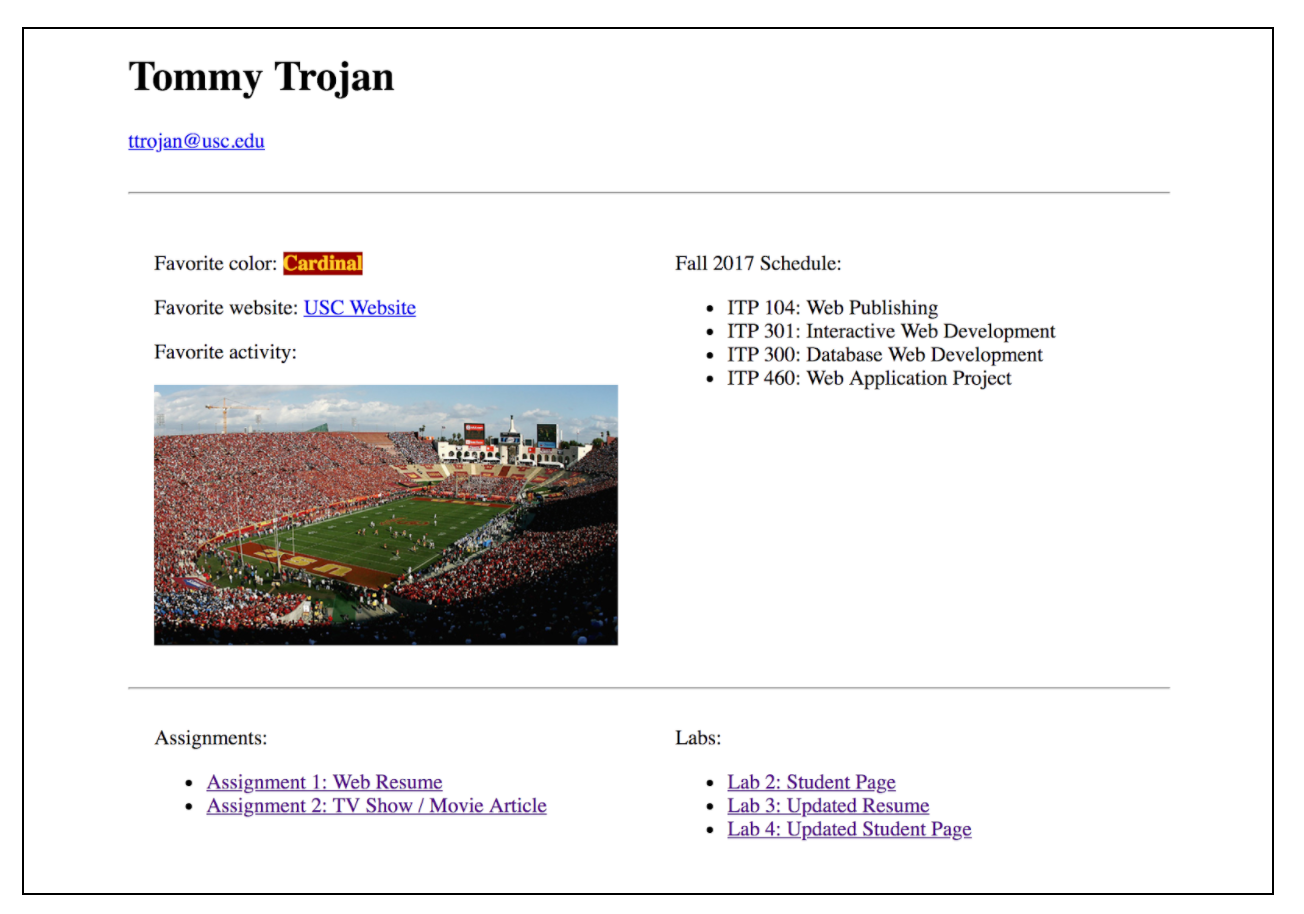
You will be re-creating your student_page.html to be structured that it has two rows and two columns.

Requirements

HTML & CSS
  1. Create a new HTML file called student_page.html. You can edit your previous student_page.html from Lab 1, but you may find it easier to just start from scratch.
  2. All content requirements are similar to Lab 1:
    1. Name, email address, favorite color, favorite website
    2. Pick a favorite activity and add an image of it
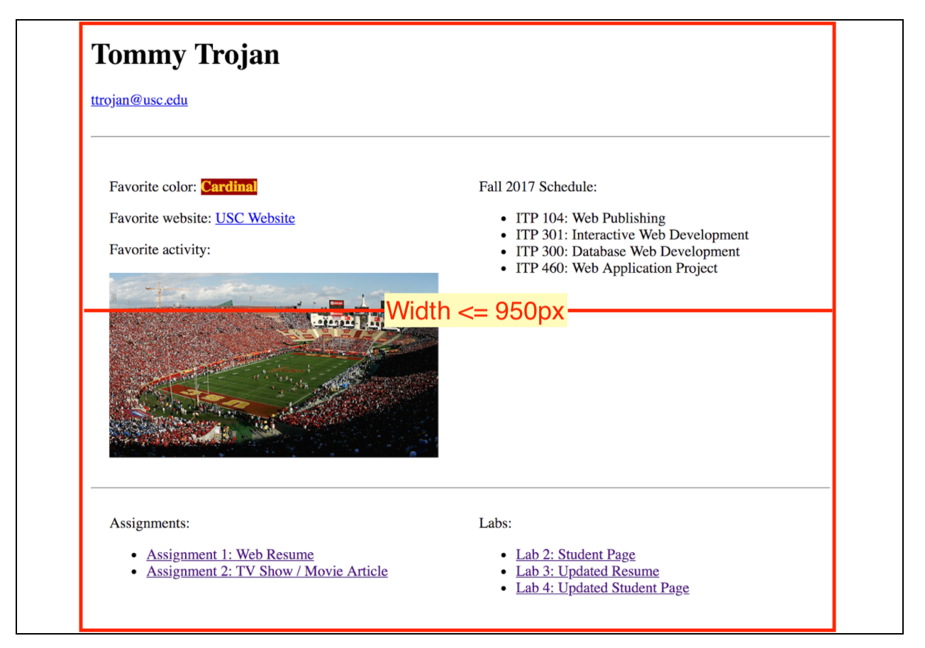
  3. Put entire content within a <div>  with set width (≤ 950px) and center it on the page.
  4. First row:
    1. Name as heading
    2. Email address
  5. Second row:
    1. First column: Favorite color, website, and activity
    2. Second column: List of classes you are taking this semester
  6. Third row:
    1. First column: Links to assignments
    2. Second column: Links to labs
  7. Add links to previous work (NOTE: add the link but clicking on the links will not actually show the page yet)
    1. You do not need to include Lab 1.
    2. Link Lab 2 to this file (itself).
  8. Feel free to add any additional styling or design as long as the requirements above are met.
  9. Make sure all tags are closed, all attributes have opening and closing double quotes, and no extraneous tags linger. You will be deducted points for syntax errors.
    1. You can use a validator like this one to check for syntax errors: https://validator.w3.org/
  10. Tips:
    1. Create a <div> for every row and column.
    2. Nest column <div> inside of each row <div>
    3. Don’t forget to clear the floats after the last column <div> of each row!
    4. You can use border-top and/or border-bottom property to create lines between each row.
Submission/Upload to the server

Please follow the submission requirements below carefully. You will be deducted points for not following submission requirements to the teeth.

  1. Open a browser and go to https://303.itpwebdev.com/cpanel (it will redirect you to https://54-148-150-30.cprapid.com:2083/).
  2. Login with your username and password (this password does not sync with your USC NETID password. You have created this password separately. If you don’t remember your password, post on EdStem and a course staff member will reset it for you).
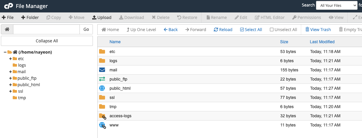
  3. Scroll down to Files section and click on File Manager. You will see a list of folders and files like below.
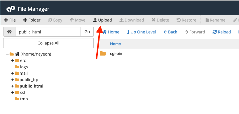
  4. Double click to navigate inside the public_html folder.
  5. Click on “Upload” to upload your files to your server account.
  6. Drag and drop your student_page.html to upload this file to the server. You will overwrite the existing student_page.html file.
  7. In addition, upload this file to Blackboard. Put student_page.html and any images into a folder named lab02 or similar. Compress the folder in to a .zip file. Go to Blackboard -> Assignments/Labs -> Lab 2: Updated Student Page and upload the .zip file. You will be able to submit multiple attempts. Only the last submission will be graded.

Sample

Annotated: