Overview
This lab is intended to give you a basic understanding of how CSS flexbox works and its benefits vs using float in previous lab/assignments.
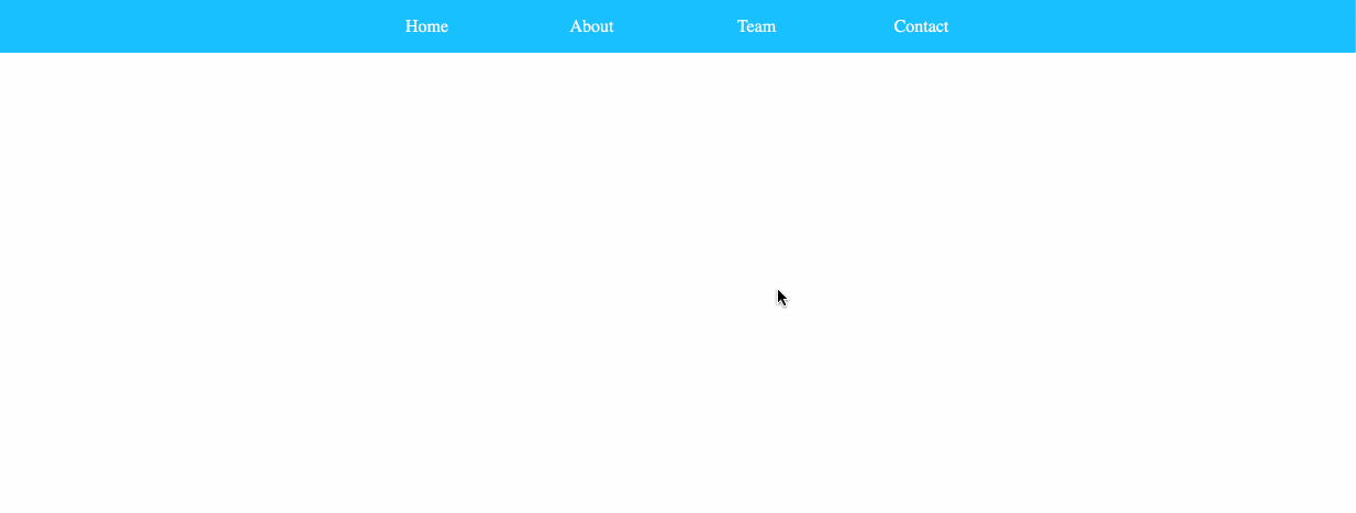
Sample
Requirements
- Create a brand new HTML file named
flexbox-nav.html(all lowercase, no spaces). - You may write CSS in either an internal or external stylesheet. No inline styles.
- Create a
<div>with four<a>inside. The links do not need to go anywhere at this point. Use # as a placeholder for href, like this:<a href="#"> - Add some basic styling, such as:
- A background color on all the
<a> - Hover effect to change background color on all the
<a> - Add padding top/bottom on all the
<a>to create some spacing on top/bottom. text-align: centerto align all the text to the center
- A background color on all the
- Using only flexbox properties (do not use floats!), style the navigation so that:
- Desktop (screen sizes 992px and above):
- All nav items are in one row.
- All nav items have the same width.
- Text is horizontally centered.
- Tablet (screen sizes 768px – 991px):
- Two nav items per row.
- Each nav item takes up half the width of the row.
- Mobile (screen sizes 0px – 767px):
- One nav item per row.
- Desktop (screen sizes 992px and above):
- You do not need to use
flex-growth,flex-shrink, andflex-basisproperties (which we did not go over in lecture). Usingwidthis enough to satisfy the lab requirements.
Submission/Upload to the server
Until the server is fixed, submit all files to Blackboard. Follow the below steps:
- Rename the folder that contains all your Lab3 files to:
ITP303_Lab3_[usc username] - Compress this folder to a
.zipfile. - On Blackboard, go to Assignments -> Lab 3: Flexbox Nav and upload the
.zipfile here. - You will be able to make unlimited submissions. Only the last submission will be graded.