Overview
For this assignment, you will create a mobile-first, responsive web page about a product. Choose any product you wish to “sell.” You can grab images and text about any existing product or you can make up your own.
Requirements
HTML & CSS
- Create a new folder named
assignment02. - Create a brand new HTML file in this folder. Name it
product.html. - Use at least ONE custom font (meaning not a default font like Times New Roman or Arial). You can use google fonts or your own font.
- Do not use flexbox or bootstrap on this assignment. You must use floats, percentages, and media queries to create rows and columns for this page and make it responsive to different screen sizes.
- Required components:
- A colored bar on top that states name of your online store.
- A product that is being sold. Display the name, image, price, number of reviews (ok if it’s an image), and description.
- A colored promo code box.
- A related products section where at least four (4) other product names and images are displayed.
- Each product column must have some spacing and border around it.
- Your site needs to be implemented using mobile-first approach.
- Default CSS should be for mobile (0-767px). Then use media queries to handle tablet sizes (768px – 992px) and desktop sizes (992px and above).
- Hint: See slides for a better understanding of writing CSS mobile-first vs desktop-first.
- Hint 2: See mobile-first sample code here: https://codepen.io/nayeon/pen/OJLQXKz?editors=1100 . Try resizing the browser and see what happens to the header. Read comments in the CSS panel.
- Before writing code right away, you may find it helpful to review the samples and plan on how to construct your divs first. Sketch out boxes on a piece of paper and plan out how divs will change depending on the screen size.
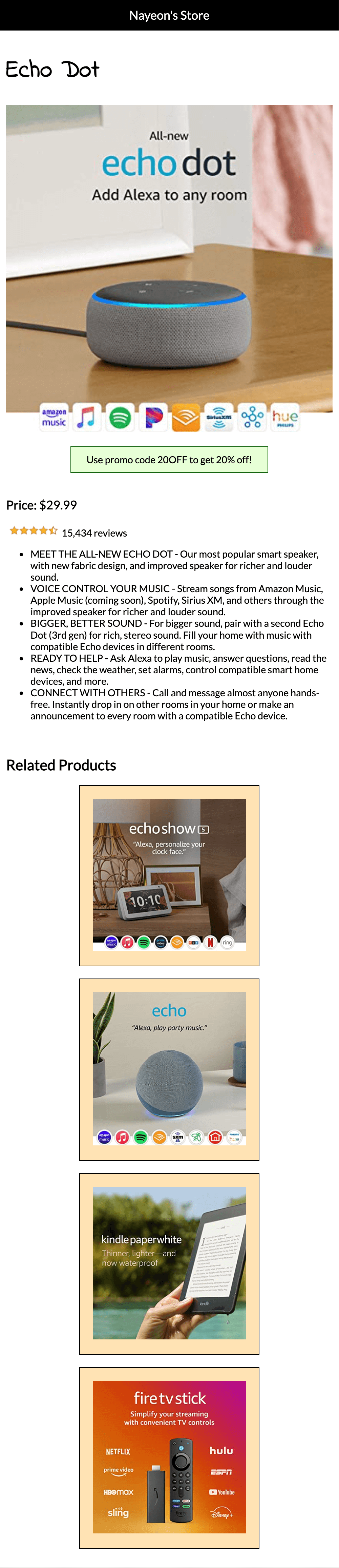
- Mobile Devices (0-767px):
- Single-column layout,
- Name of the product is above the product image.
- Hint: You can hide any elements using
display,visibilityoropacity. Show this product name on only mobile screen sizes.
- Hint: You can hide any elements using
- Below the product image, display a colored promo code box with some info in it.
- Promo code box width is smaller than the main product’s image.
- Promo code box is horizontally centered.
- One (1) related product item is displayed per row.
- Create a
<div>for every related product. Put image inside this div. Add border around the<div>and not the image. - Each related product image has some spacing around it.
- Background color for each related product column is not required but will be helpful to visualize what your code is doing.
- Create a
- Related products all have a width that is smaller than the main product’s image.
- Related products are all horizontally centered.
- All images scale up as browser size increases.
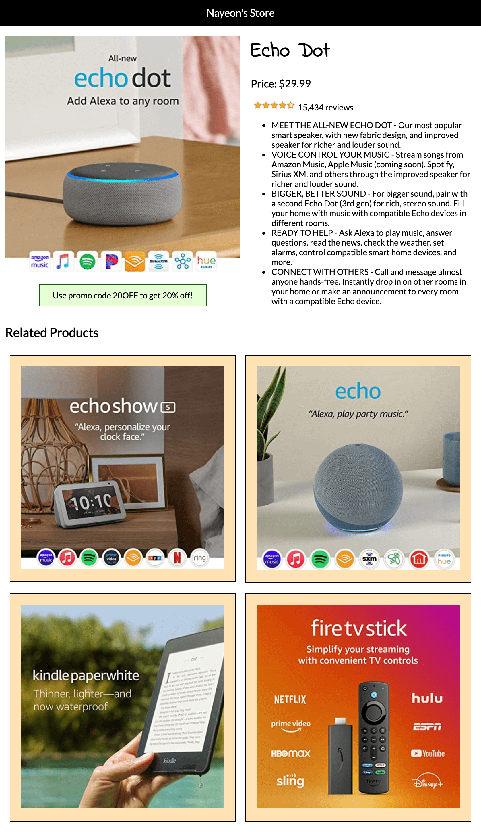
- Tablet Devices (768px – 991px):
- Two-column layout – the product image and promo code box on the left and the product details on the right.
- Product name is on top of the product details on the right.
- Hint: You can hide any elements using
display,visibilityoropacity. Show this product name on screensizes for tablet devices and up.
- Two (2) related products listed per row.
- All images scale up as browser size increases.
- The bar on top with store name is as wide as the browser
- Two-column layout – the product image and promo code box on the left and the product details on the right.
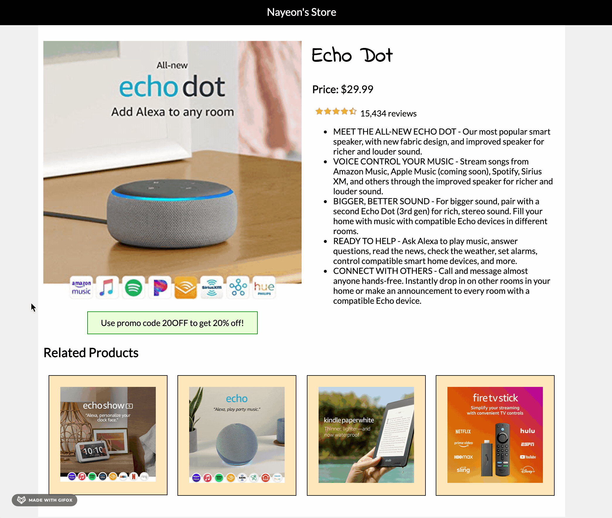
- Desktop Devices (992px – above):
- Two-column layout,
- Four (4) related products listed per row
- All images scale up as browser size increases.
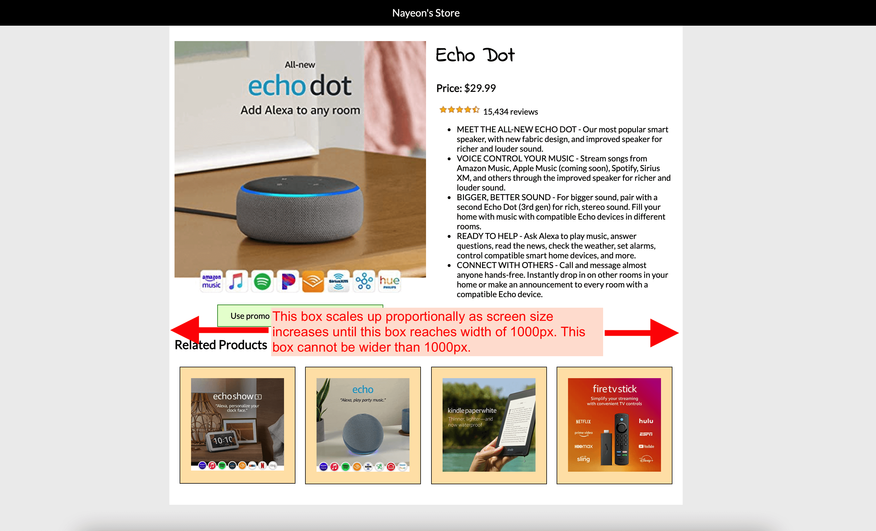
- The “box” that contains all the product information must not grow wider than 1000px.
- The bar on top with store name must always be as wide as the browser.
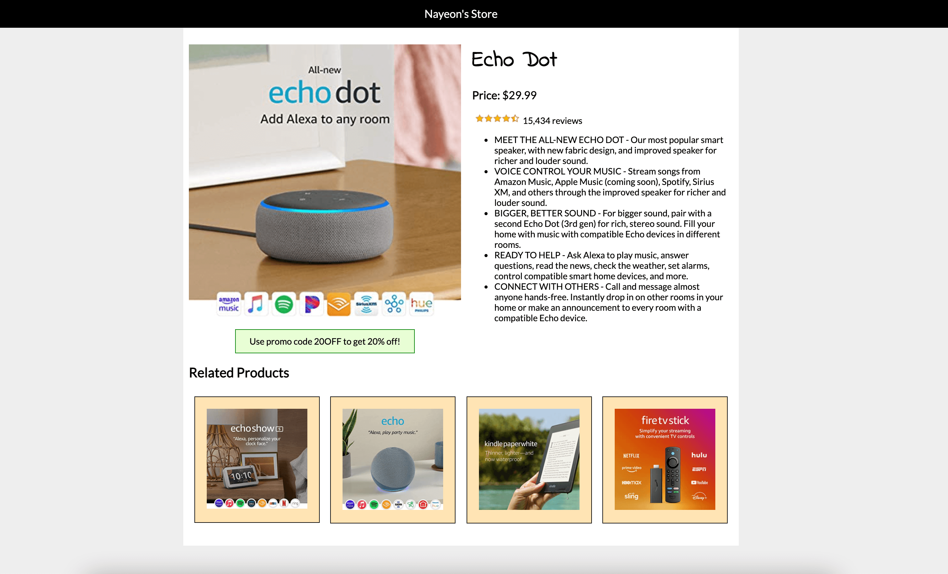
Hover effect:When user hovers over any related product, show an overlay (div) that contains the related product’s name.The overlay must overlap the related product image (not be below the image).The overlay must be positioned at the very bottom of each product.The width of the overlay box must be exactly the same width as the related product column at all screen sizes.Horizontally center the related product’s name in the overlay.The overlay must have a background color that is slightly transparent.Hint: CSS valuergba()is helpful here.
- For each device, adjust font sizes, images sizes, etc. as necessary.
- All elements and content need to be readable.
- Feel free to add additional features, as long as all requirements above are satisfied.
- Check your HTML and CSS syntax. You will be deducted points for any syntax errors, tags not closed/not used, etc.
- Use a validator like this one: https://validator.w3.org/#validate_by_input.
Submission/Upload to the server
Until the server is fixed, submit all files to Blackboard. Follow the below steps:
- Rename the folder that contains all your A2 files to:
ITP303_Assignment2_[usc username] - Compress this folder to a
.zipfile. - On Blackboard, go to Assignments -> Assignment 2: Responsive Product Page and upload the
.zipfile here. - You will be able to make unlimited submissions. Only the last submission will be graded.
Sample
Note: Samples below don’t always meet all the requirements. Make sure to follow the requirements rather than solely relying on the samples.
Mobile:
Tablet:
Desktop:
Desktop sizing details:
Hover Effect: